
Most repainting we see happens because a color looked right on a chip and wrong on the wall. A two-inch square under store lighting tells you very little about how a color will look across a whole room in a Coulee Region winter, with gray light from the window and warm bulbs at night. Choosing well is mostly about testing properly. Here is how to do it.
Start with what is staying
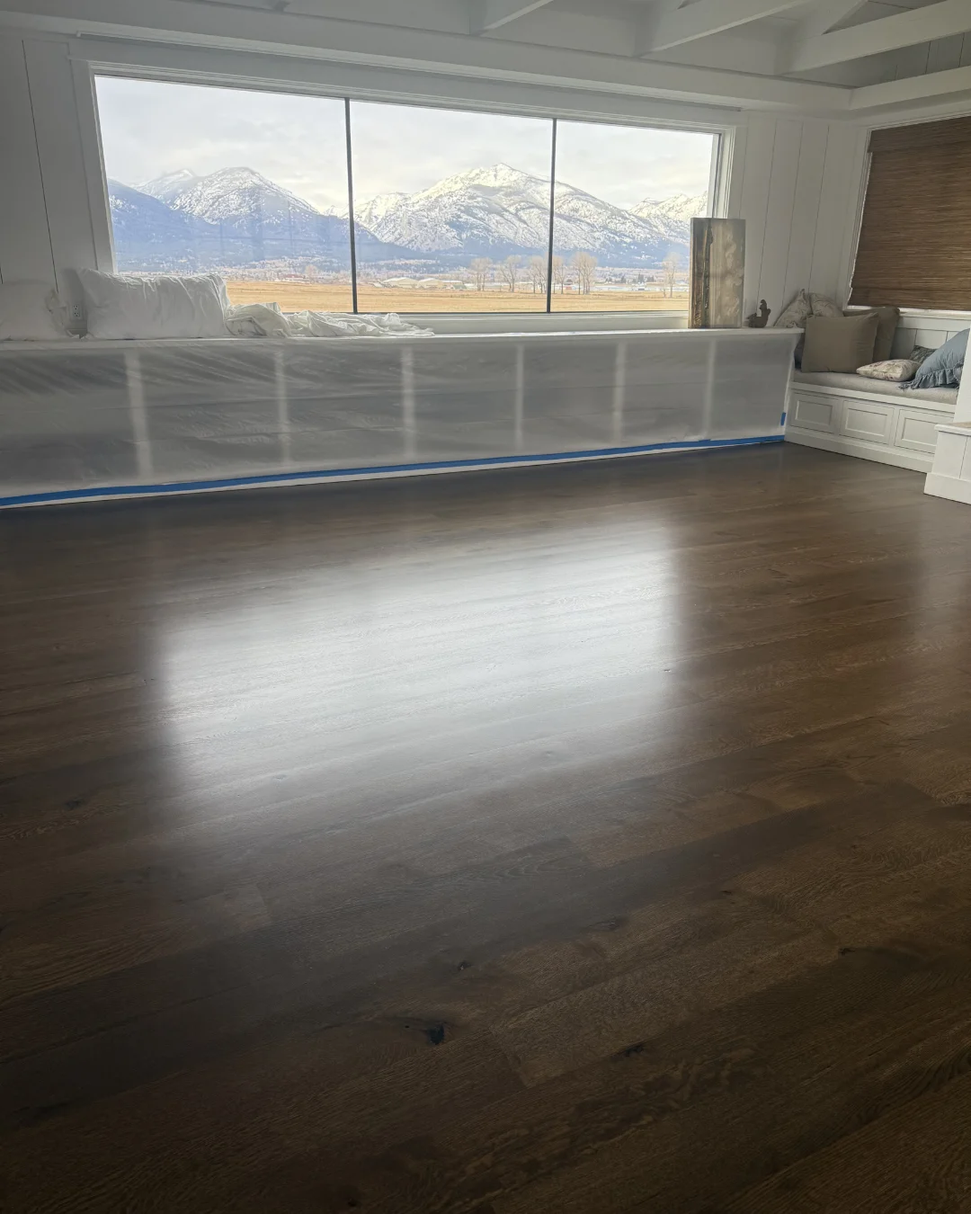
Before looking at paint, look at what you are not changing: the floor, the countertops, the cabinets, the fireplace stone, a large sofa. Those set the undertones the wall color has to live with. A cool gray that looks crisp on its own can look dirty next to a warm oak floor. A warm cream can look yellow next to cool white quartz.
If the floor is changing too, choose it first, because it is the larger and harder surface to change. How to choose a flooring color covers that side.
Light changes everything
The same paint looks different in every room of a house. Rooms with north-facing windows get cooler, softer light all day, which pulls colors toward gray and blue and can make cool colors feel cold. Rooms facing south get warmer, brighter light, which makes colors look lighter and warmer than the chip. East-facing rooms are bright and warm in the morning and cooler later, and west-facing rooms do the opposite.
Artificial light matters too. Warm bulbs push colors toward yellow, and cooler bulbs toward blue. Look at your samples at night with your own lamps on, because that is when you will spend much of the winter looking at them.
Test big, and test on more than one wall
- Use large samples: paint a piece of white poster board, or buy a large peel-and-stick sample. A chip held to the wall is too small to judge.
- Put the sample on at least two walls, one near the window and one in the darkest corner, because the same color reads differently on each.
- Keep the old color from framing the sample. A strong existing color makes the sample look different by contrast, so set it against a white border or move it around.
- Live with it for two or three days and look at it morning, afternoon and night before deciding.
Undertones
Every neutral has an undertone. Whites lean warm (yellow, red) or cool (blue, green). Grays lean blue, green or purple. Beiges lean pink, yellow or green. Undertones are hard to see on a single chip and obvious on a wall.
The easiest way to see an undertone is to compare. Put several whites or grays side by side on a sheet of plain white paper, and the differences show up straight away. The undertone that agrees with your floor, counters and fabrics is usually the right one.
Lighter on the wall than on the chip
Color looks stronger across a whole room than on a sample, because the walls reflect it onto each other. A color that looks gentle on a chip can feel intense on four walls. If you are between two shades, the lighter one is usually the safer choice for a whole room. Strong colors often work better on one wall, a ceiling, a door or built-in cabinetry than on every wall.
Connecting rooms
In an open floor plan, you see several rooms at once, so the colors have to work together. A simple approach is one main wall color through the connected spaces, with stronger colors kept for rooms with doors, such as bedrooms, an office or a powder room. Using one trim and ceiling color throughout ties the house together even when wall colors change.
Sheen changes how color reads
The same color looks slightly darker and richer in a higher sheen, and flatter and softer in a matte finish. Sheen also decides how well a wall cleans. Kitchens, bathrooms, hallways and kids’ rooms usually need something more washable than a flat finish.
How sheen, primer and coat count affect the result is covered in interior paint sheen, primer and coats.
Ceilings and trim
Ceilings are usually painted a flat white or a very light version of the wall color, which hides surface flaws and keeps the room bright. Trim is usually a white with a slightly higher sheen. Pick the trim white alongside the wall color, not separately, because a warm white trim against a cool wall color can look off.
Ceiling stains and cracks are covered in painting ceilings, and trim and doors in painting interior trim and doors.
Getting help with color
Color guidance is part of our interior painting estimate, not a separate invoice. We can look at your rooms in their own light, alongside the floors and cabinets that are staying, and help you narrow the samples down. Keep a labeled can of every color for touch-ups, because colors can drift between batches. Book a free in-home estimate and we will talk through colors while we measure.